N26 updates its web app
Fintech startup N26 wants to compete with traditional banks on all fronts. And it means providing a useful web interface to view your past transactions, transfer money and more. Most users likely interact with N26 through the mobile app. But it doesn’t mean web apps are useless.
Contrary to Revolut, N26 has had a web interface since day one. It lets you control most things in your account. For instance, you can add a new recipient and send money. You can configure notifications, get a PDF with your IBAN number and download banking statements.
You can also lock your card, reset the card pin, reorder one or block some features from the web. This way, if somebody steals your phone with a wallet case, you can still go to the website and disable your card.
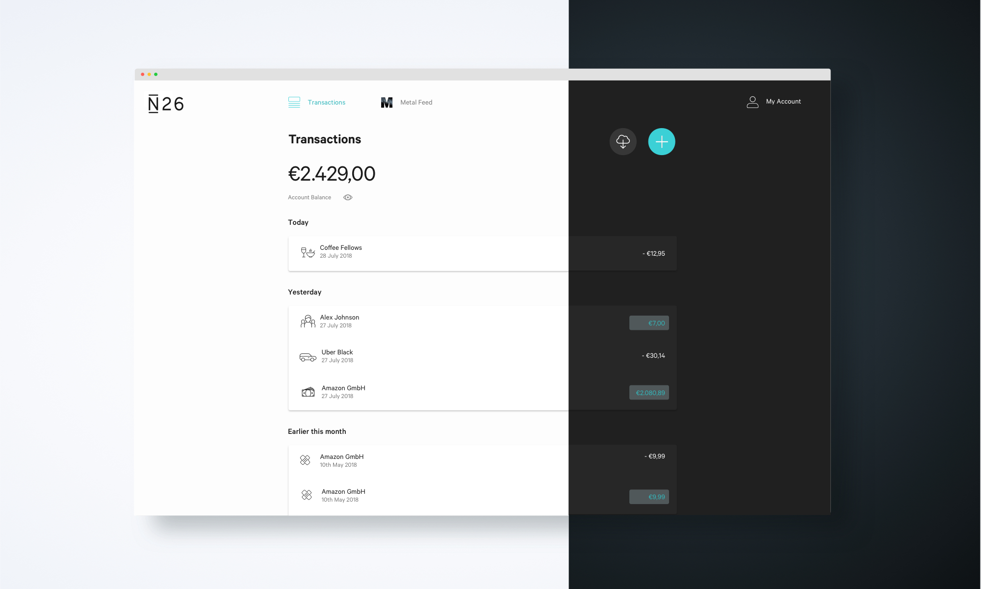
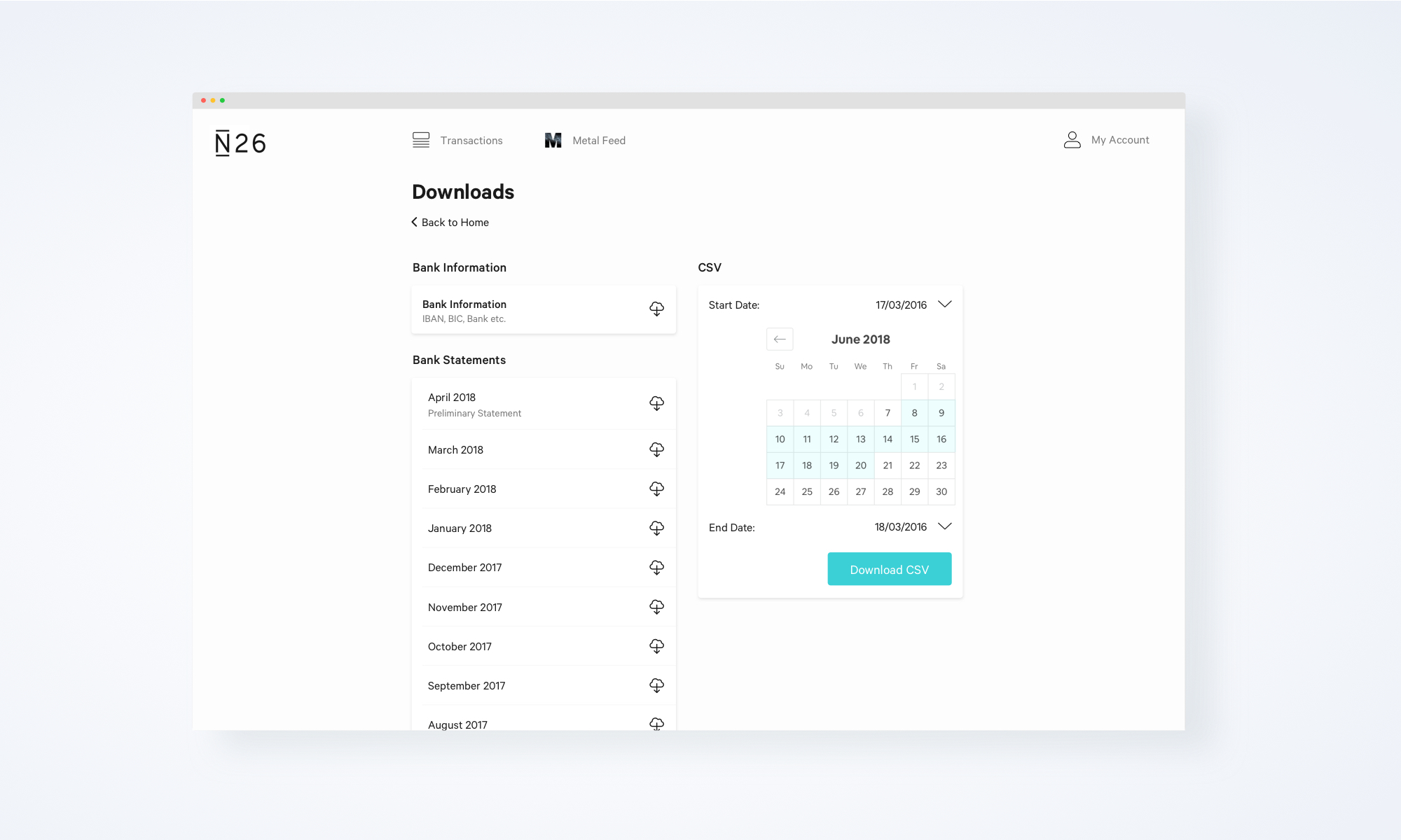
With today’s update, N26 is mostly refining the design of the interface. The left column is gone, and you now get a feed of transactions front and center. When you press the download button, you can download bank statements, a CSV with all your past transactions in case you want to put them in Excel and the PDF with your IBAN number.

But the company seems to be really excited about one new feature in particular — dark mode. You can now switch the entire interface to black. This will be particularly useful when Apple introduces macOS Mojave with dark mode across the operating system.
You can now also tick a box when you log in to enable discreet mode. This feature hides your balance and transactions in case you don’t want your coffee shop neighbor to look at your bank account.
The new web app is responsive, which means that it works on computers with big screens as well as mobile phones. The information on your screen changes depending on the width of your browser window. The new N26 for web should be available now.

No comments: